Orderio
Overview
Apps like UberEats, DoorDash, and others have undoubtedly become household names. However, despite their massive user bases and engagement, the food delivery market faces two significant challenges:
Low profit margins for both restaurants and delivery platforms from online orders.
High premiums for customers, who often pay extra on top of their orders.
To address these issues, Orderio partners with local businesses to organize bulk orders for specific residences at set times throughout the week. This model provides restaurants with a consistent stream of orders, reduces service costs, and allows customers to pay little to no delivery fees.I was tasked with designing Orderio’s first mobile app for their test launch at Rutgers University. Let’s dive in!

Foundational Research & Analysis
From the outset, I made it my priority to thoroughly understand the product and its underlying concept. The founder and I held multiple sessions where we discussed his vision, previous experiences, industry insights, and existing traction. We even scheduled and conducted calls with potential end-users to better understand their needs and gauge how well they resonated with our concept. The feedback was promising, which encouraged us to move forward with the initial idea.
We concluded that college students living on campus would be the primary target audience during the initial phase of the app, though we recognized the potential to expand to other demographics later on.
As part of my foundational research, I conducted an in-depth analysis of the food delivery market, seeking valuable insights and inspiration for our product. Here are my key findings:
Insight 1
The food delivery market is saturated with competitors offering similar features, with little differentiation in their unique selling propositions. While some apps may vary slightly in features or user experience, overall, there is minimal distinction between them.
Insight 2
Despite the lack of differentiation, most competitors have highly efficient user journeys, a result of the market’s maturity and the demands for high efficiency.
User Persona & Survey
Given the specialized target audience for the first iteration of the app, we decided to consolidate our research into a user persona. This would allow us to empathize with the user and approach the product design from their perspective. Here’s the persona we developed:
Name: Lisa Hernandez
Education: Junior at Rutgers University, New Brunswick
Hometown: Cherry Hill, NJ, US
Residency: Busch Residence Hall, Rutgers University
Quote: "I'm always either studying or hanging out with friends... I hate cooking, and even if I liked it, I just don't have the time. Ordering food online makes me feel guilty—it’s so expensive. I often place group orders with friends from one account to save money."
To further validate (or disprove) our initial product hypothesis, we conducted a formal survey of 12 Rutgers University students living on campus. Here are the key insights:
Students are very budget-conscious: They dislike fees, love discounts, and want food delivery apps to be as transparent as possible with final pricing.
No loyalty to food delivery apps: Students prefer whichever service is easiest and cheapest, with no strong brand allegiance.

Information Architecture & User Flow
We initiated the next phase of development by creating an Information Architecture that provided a comprehensive overview of the app's scope and complexity. This gave both the developer and me a clearer direction moving forward. After several iterations, we refined the architecture diagram, ensuring it accurately reflected the app's structure.
Next, we reviewed the app’s user flow from the perspective of our user persona, focusing on key processes such as sign-up, restaurant selection, and order placement. This approach allowed us to ideate and streamline the user experience, making it as intuitive as possible.


Hi-Fi & Delivery
Given the tight time constraints and the well-established patterns in the food delivery market, we opted to move directly into high-fidelity prototyping. Many of the essential user flows, such as order placement, registration, and payment processing, have already been successfully solved by other apps. Attempting to reinvent these processes from scratch in low-fidelity wireframes would have been inefficient and redundant.
Instead, we chose to focus our time on refining the unique aspects of our app, such as bulk ordering, group discounts, and optimized delivery logistics. These elements required careful design consideration, as they set us apart from competitors and addressed the specific needs of our target audience. For these unique features, we sketched out some initial low-fidelity wireframes to explore ideas, but quickly transitioned to high-fidelity versions to ensure we could iterate faster and conduct usability testing sooner.
This approach allowed us to leverage existing design conventions for common user flows while dedicating more time to the innovative aspects of the app that would provide real value to our users.


Impact
The app was successfully launched on both the App Store and Google Play Store and has continued to evolve over the past year. Since its initial launch, it has undergone multiple target audience pivots and UI refinements, adapting to market needs. It was also rebranded as Ekatree and is now steadily growing, focusing on serving luxury apartment buildings in New York City.
What I Learned
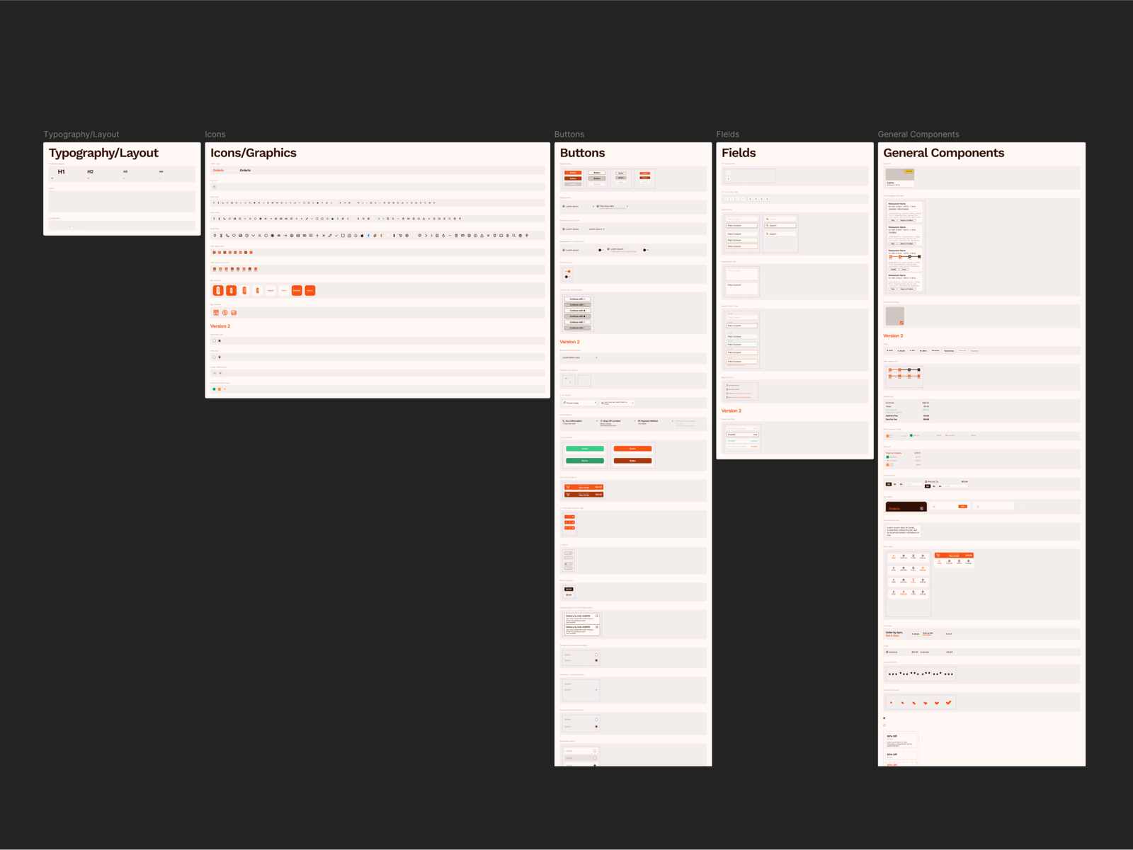
As my first major UX/UI project, designing Orderio was a pivotal experience in my career journey. While I successfully delivered a functional app, I encountered numerous challenges that taught me invaluable lessons about design systems, conventions, and documentation.
One of the key areas where I made mistakes was with the design system. I underestimated the importance of following established conventions and naming standards, which led to inconsistencies throughout the project. Additionally, my approach to documenting the design elements was less organized than it should have been, creating friction during the handoff to developers.
Looking back, many of the visual and UI design decisions I made would be completely different today. With more experience, I now recognize how certain choices, from color palettes to button placements, could have been more user-centered and efficient. My understanding of hierarchy, spacing, and accessibility has evolved significantly, and I now approach UI design with a much more refined perspective.
Despite the mistakes, this project was instrumental in my growth as a designer. It taught me the importance of maintaining a well-structured design system, adopting clear component naming practices, and prioritizing consistency across the UI. These lessons have shaped how I approach design today, making me a more thoughtful and methodical designer.