Neighborly
Overview
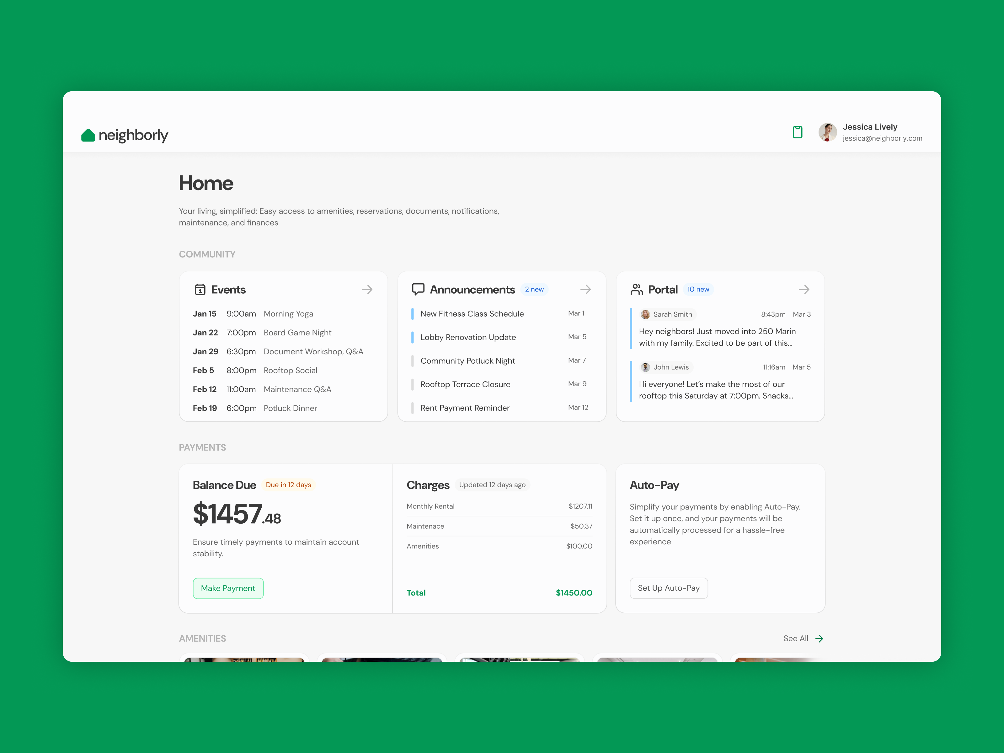
Many luxury apartments in the US struggle to efficiently manage amenities, repairs, and payments while ensuring a seamless experience for residents. Existing solutions often suffer from fragmented applications, limited personalization, and outdated, cumbersome interfaces. Having experienced these issues firsthand as a resident of a luxury apartment, I identified a clear opportunity for improvement. My hypothesis was that a unified desktop and mobile web application, tailored specifically to the needs of the building’s residents, would provide a more user-friendly and accessible solution. With this vision in mind, I set out to bring it to life...
User Research
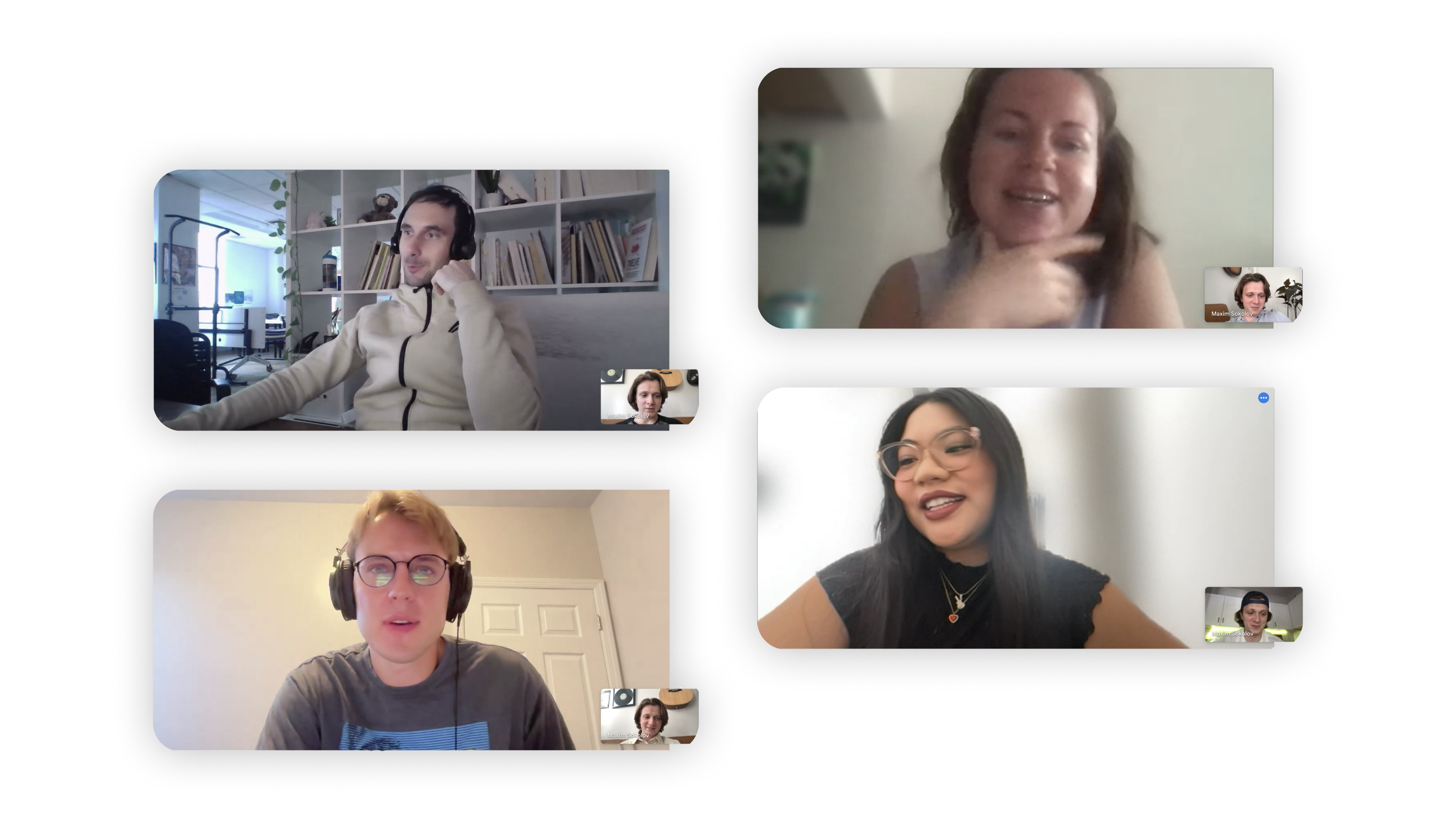
Even though I lived in the building myself, I didn’t want to rely just on my own assumptions, so I set up interviews with staff and residents to dig deeper. I ended up conducting six interviews following a research script I devised and here’s what I found:
Where I was right:
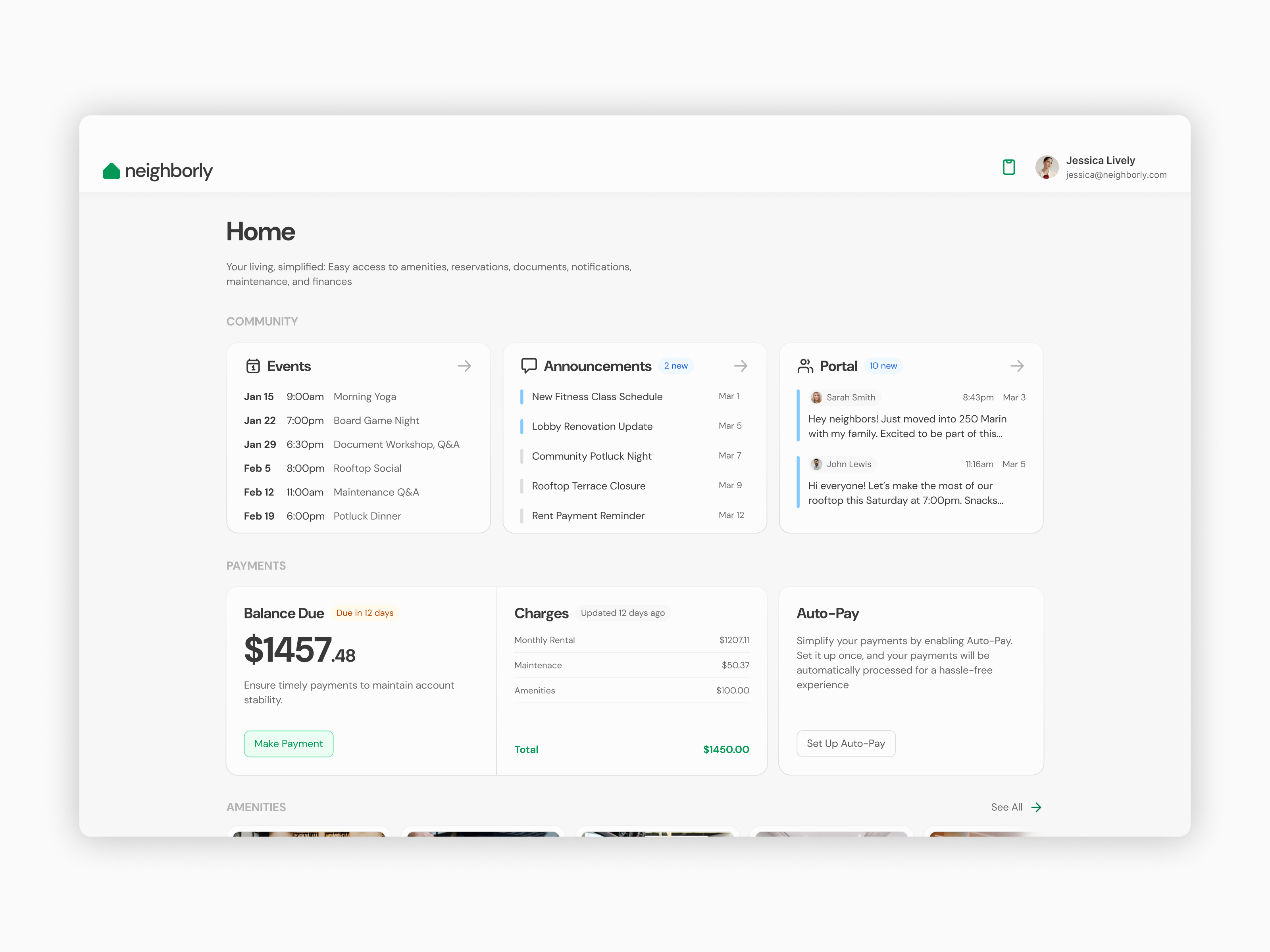
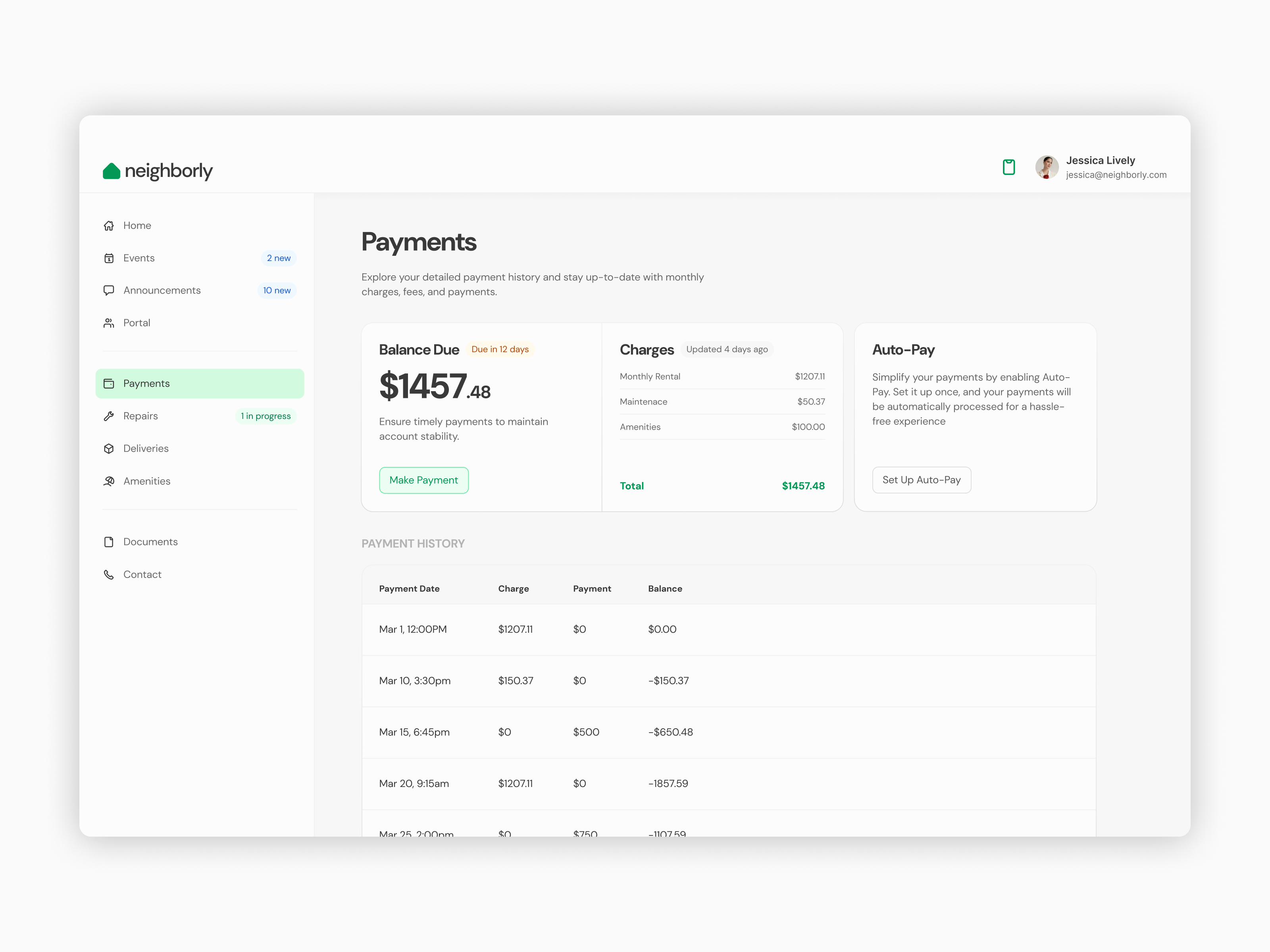
People were really craving a single, easy-to-use platform for payments, amenity reservations, and repair requests. Efficiency and convenience were key.
The current solution’s outdated interface annoyed residents even more than I expected.
Where I was wrong:
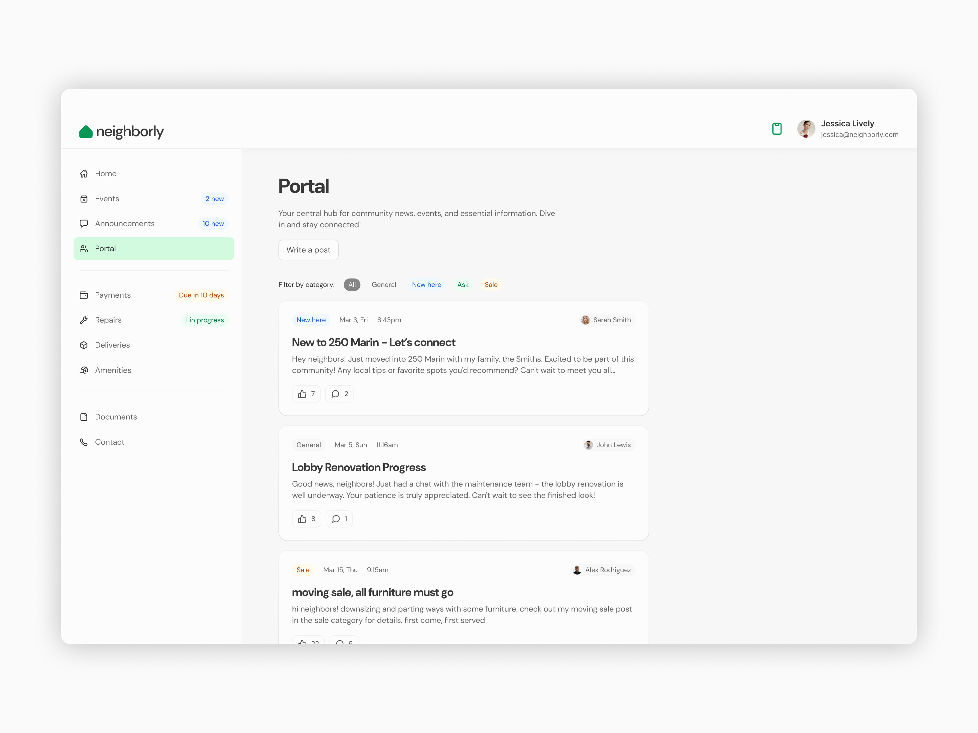
I thought residents wouldn’t be interested in socializing and mostly kept to themselves. But the interviews showed that’s not the case. People do want to connect with their neighbors, but beyond the occasional small talk in the elevator, they don’t have an easy way to build real relationships or attend in-building events.
A surprise discovery:
Something I hadn’t even considered was how frustrating it is for residents to dig through their inbox to find apartment-related documents. They loved the idea of having quick access to all their lease documents directly in the app, which could be a really helpful extra feature.
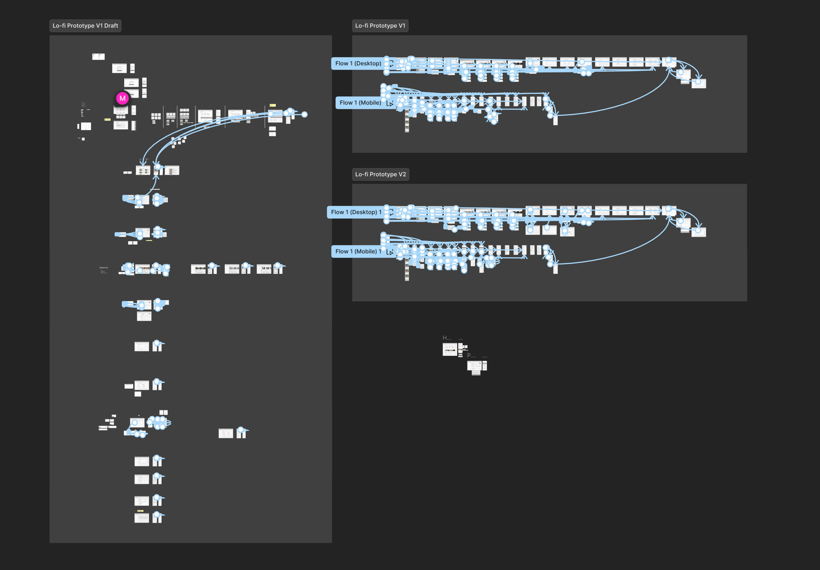
Lo-fi prototype
The next logical step was to walk myself through the app’s flow using a low-fidelity prototype to test the assumptions made in the IA. While creating the screens, I ended up rethinking the placement of several pages and the information they held. The prototype went through two iterations, and looked something like this:
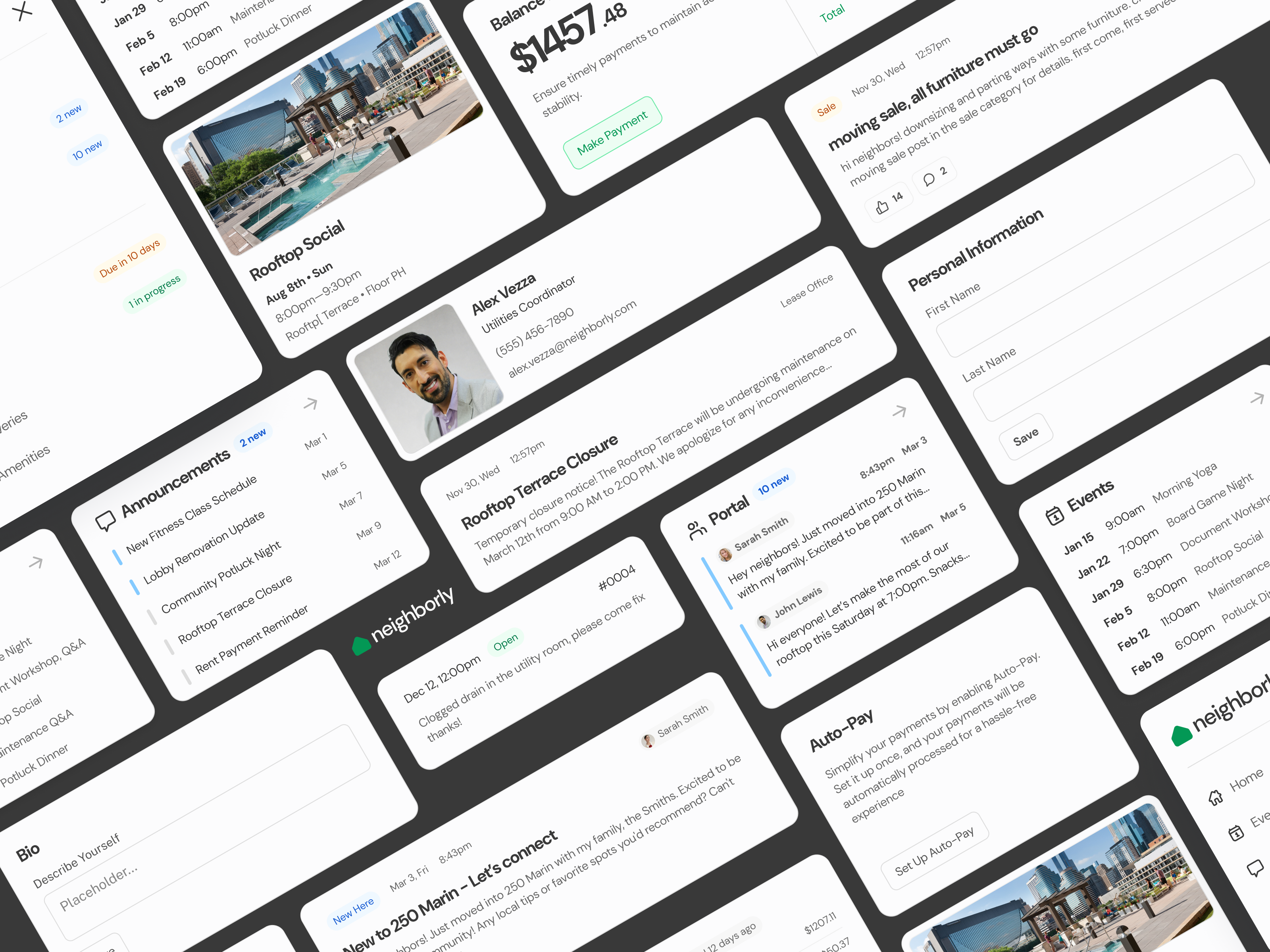
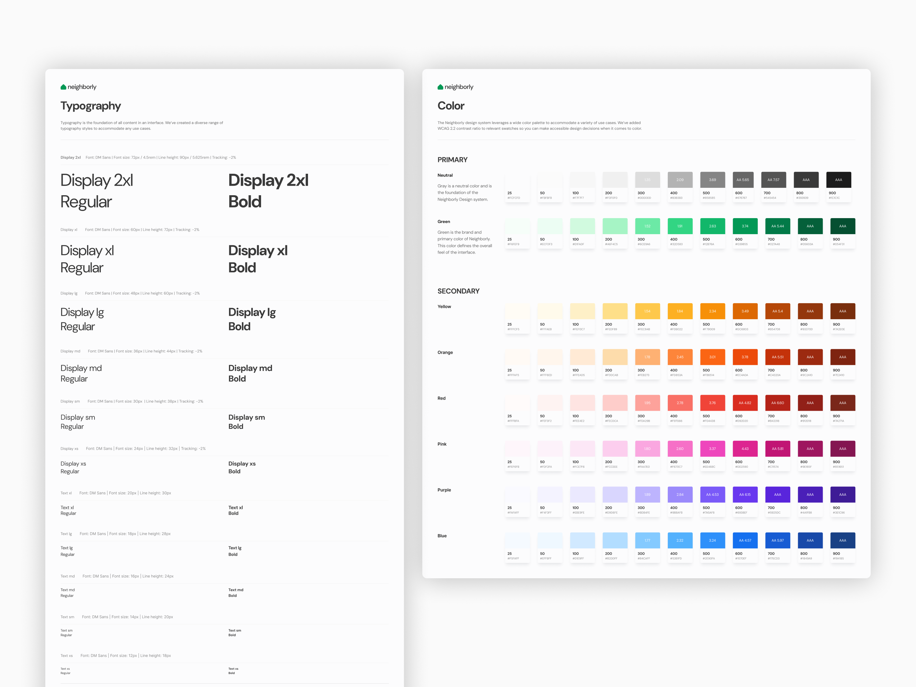
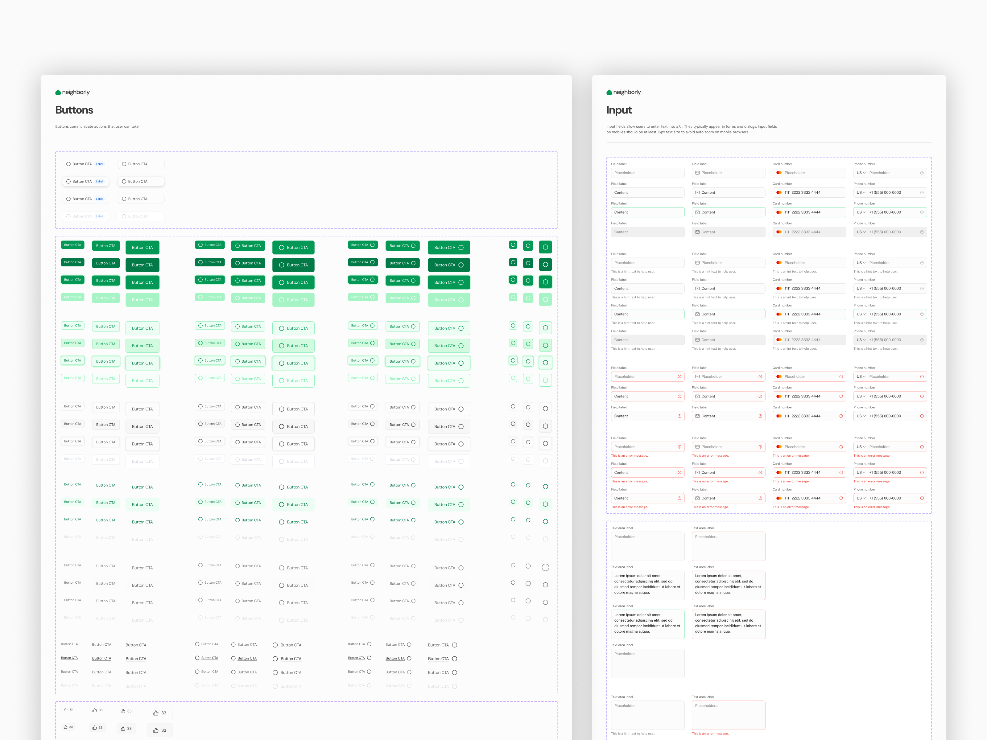
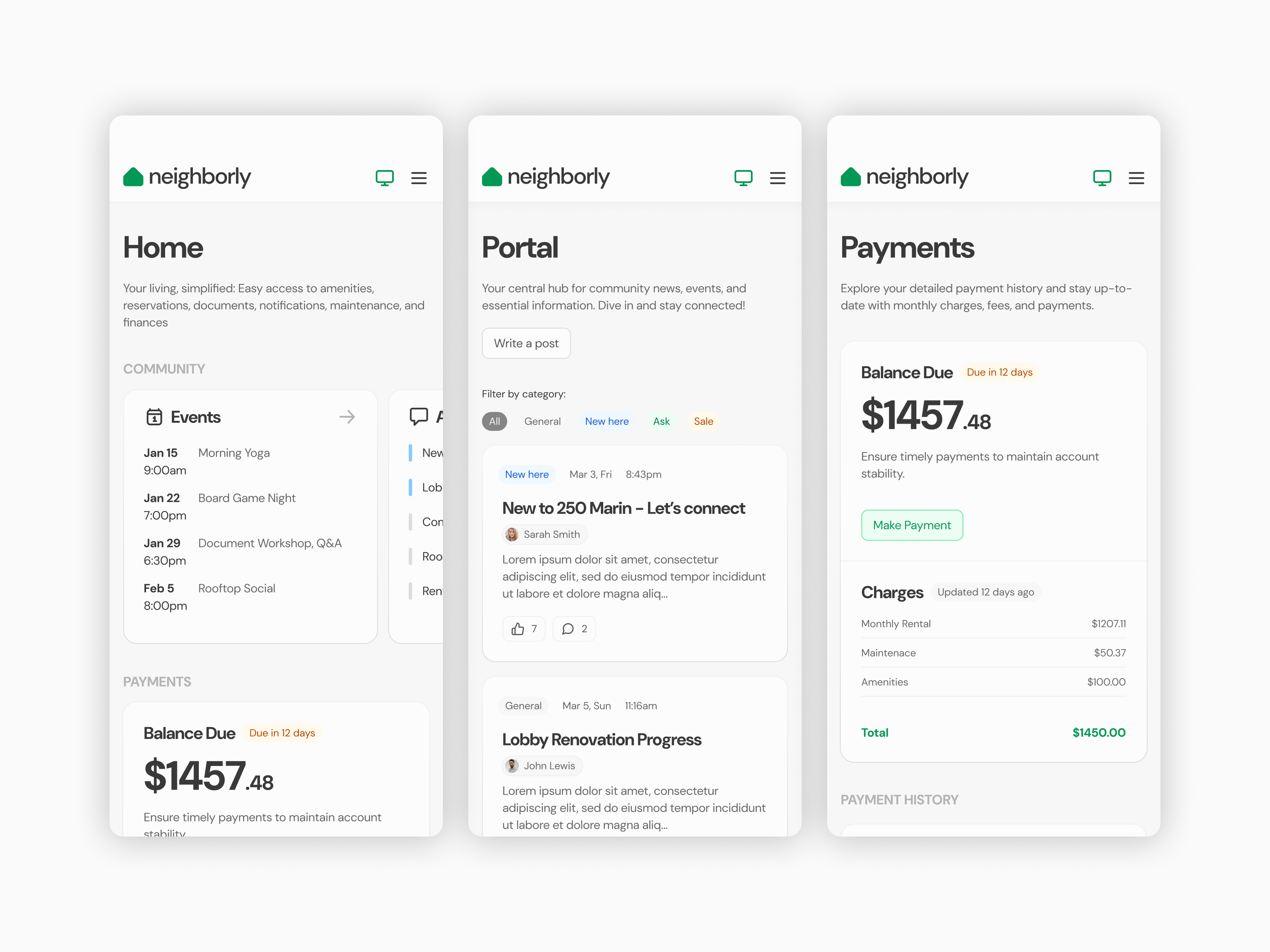
Hi-fi prototype
At this stage, I shifted my focus to pixel-perfect details, setting the color palette, typography, and base components, while also designing more complex elements like cards, tables, and navigation. My goal was to document all component and layout behaviors in detail to ensure a smooth hand-off to developers. I built the Neighborly Design System using the Untitled UI kit as a base but made plenty of customizations to suit the project’s needs. I also put a lot of effort into creating pixel-perfect interactions between pages so stakeholders could see how the app functions in real life and make necessary adjustments before development starts.
What I learned
Although it was a personal project, I quickly realized that some of the feature flows were more complex than I initially anticipated, leading me to refine and prioritize the scope to maintain focus on the most critical elements.
At the time, Figma variables were just being introduced, and for simplicity’s sake, I chose to stick with a basic color palette using Figma styles instead of creating a more advanced semantic palette. In hindsight, I’ve learned that using a semantic palette would have been a more scalable and efficient solution for managing the color system in larger projects.
I also learned the importance of iteration. Going through multiple rounds of feedback, especially in the design system and prototype stages, helped refine both the user experience and interface, making sure all the details aligned with the project goals.
Working through the development of a comprehensive design system made me realize how crucial clear documentation is for effective collaboration with developers. Having detailed behavior descriptions for components and layouts helps prevent miscommunication and speeds up the development process.