Kyruus Health Accessibility
Overview
At Kyruus Health, I took the lead on a key accessibility project aimed at tackling issues identified in an in-depth audit of one of our flagship products, Pre-Visit. Kyruus had committed to meeting WCAG 2.1 AA standards, and my role was at the heart of making that commitment a reality.Over three months, I reviewed and addressed over 60 accessibility tickets, working hands-on with developers, designers, and even the legal team to brainstorm and implement practical solutions that met both technical and legal standards. This project not only deepened my knowledge of accessibility best practices but also strengthened my skills in leading cross-functional efforts to ensure inclusive design stays a priority.

My Process
I started by carrying over all information from the audit platform to our Sheets table, where I set up a system to track progress on tickets. I documented all of my communications, processes and solutions throughout the initiative there as well. Here's a summarized process that I used when approaching each ticket over the course of 3 months:
1) Ticket analysis and WCAG guideline review
Begin with a thorough review of each ticket, referencing related WCAG guidelines and coordinating with the audit firm’s contact to clarify requirements.
2) Current solution assessment
Examine the current solution from both the user’s perspective and within code with the dev team.
3) Identify technical and legal constraints
Outline any technical and legal limitations to identify what is feasible under current scope.
4) Research, solution iteration and proposal
Iterate on potential solutions, refining them based on feedback from devs and the design team, as well as scope. Present a final solution that aligns with AA standards. in a dev-ready ticket.
5) Documentation and tracking
Record all insights, decisions, and tickets systematically in Jira and Sheets for team visibility and future reference.
Defining the Problem
Ticket highlight: Signature component replacement
One of the key issues identified by our accessibility audit partner involved the on-screen signing component, SignaturePad, which I'd like to highlight in this case study. SignaturePad is a critical feature across the product, as it’s required to complete nearly all user flows within the application.
However, it posed a major accessibility barrier, particularly for users unable to drag a finger or pointer across the screen. This limitation made the application inaccessible to screen-reader users, keyboard-only users, individuals with mobility impairments, and anyone with conditions affecting fine motor skills, effectively blocking them from completing all flows.
Below, I’ve outlined the current solution and detailed the two primary user flows that rely on this component:


Research
Our accessibility audit partner recommended exploring DocuSign’s approach to e-signatures, a solution widely recognized for its accessibility and effectiveness. After reviewing DocuSign and other e-signature tools, we identified four potential alternatives:
Option 1: Draw
This was our current solution, allowing users to draw a signature directly on the screen. However, it was inaccessible to screen-reader users, keyboard-only users, and individuals with motor disabilities, making it clear this option could not stand alone.
Option 2: Upload image
While adding an option to upload an image of a handwritten signature seemed valuable, it posed accessibility challenges. Users would first need to draw a signature on paper, take a photo, and then upload it, adding significant steps and time. This process could be especially difficult for those unable to draw a signature on a screen, making it impractical as the main solution.
Option 3: Checkbox/radio
Taking inspiration from "I agree to the Terms & Conditions" type of buttons in so many applications online, our hypothesis was that this would be the easiest solution to this problem, given that the component performing this function is detected by screen-readers and other accessibility-enabling tools. However the bottleneck was that we didn't know whether this type of signature would be legally compliant, so we decided to put a pin on this solution and keep searching.
Option 4: Type
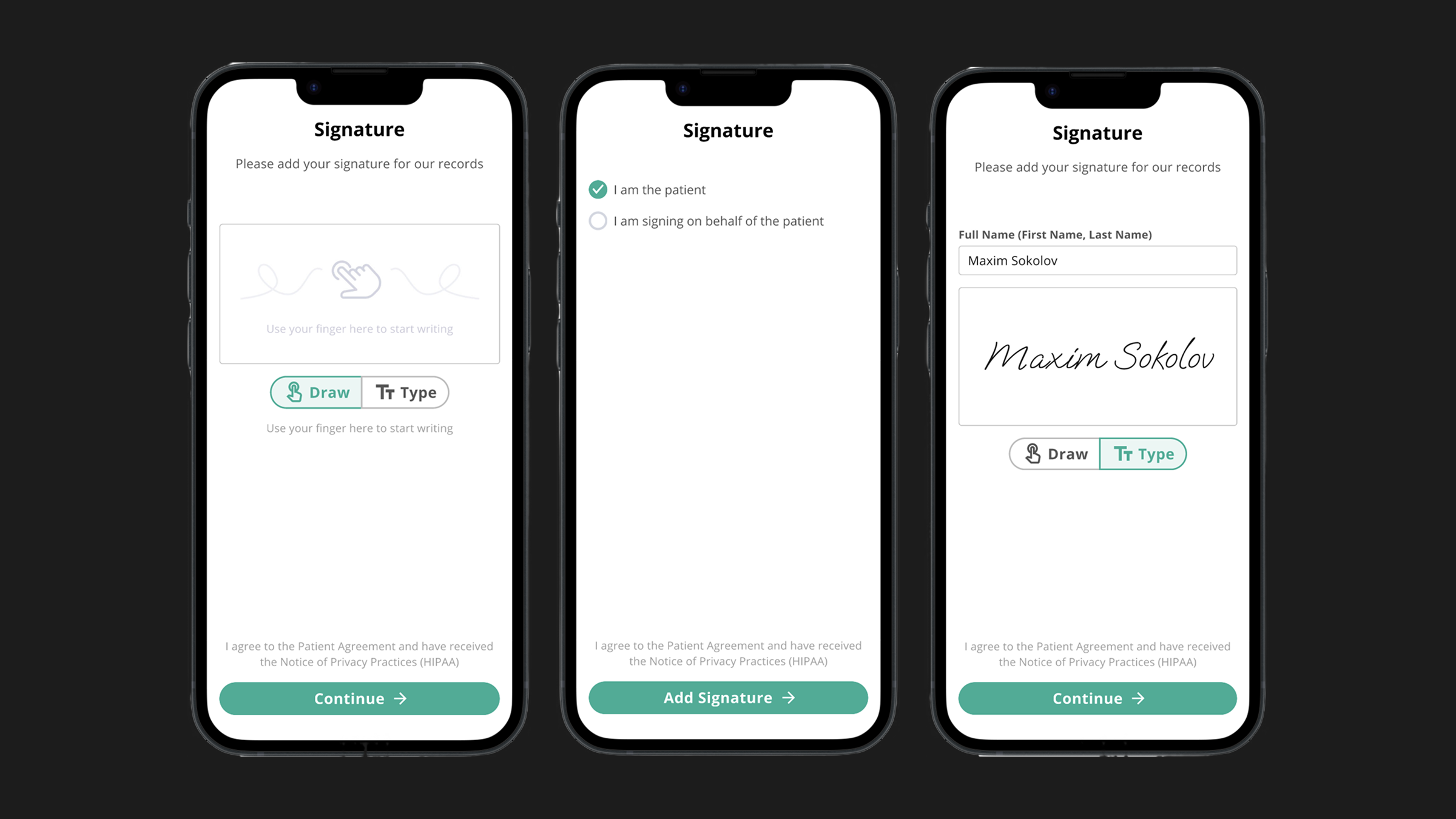
Allowing for the user to type out their full name in a field and then convert it to a handwritten signature is the solution that we were pointed to by our audit partner in the first place and it looked very promising. Assuming the field itself is screen-reader accessible, it could totally work, however, just like with Option 3, we needed clarification from our legal team on whether it would make for a viable signature.


Legal Process & Permissions
After identifying the Checkbox and Type options as our top e-signature solutions, we needed legal clarification on their viability, including whether any e-signature metadata transfer would be required. I prepared a presentation outlining the feasibility of both options and presented it to the legal team.After their review, we received approval to proceed with the Type option, as it was confirmed that the Checkbox option did not meet HIPAA compliance requirements.
Design Iterations
Guided by DocuSign’s tabbed navigation as our ideal model, we set out to implement a similar layout within the constraints of our design system. As our product was transitioning to the MUI design system, we were restricted to using components within this framework to maintain alignment with broader product goals and keep the scope manageable.Here’s a brief overview of our approach:
The MUI design system offered two components with tab-like functionality — Tab and Button Group. Through exploration and testing of different layouts, we ultimately chose the Button Group component positioned directly below the signature area for two main reasons:
Improved Mobile Accessibility: Placing the component toward the bottom of the screen allowed easier reach for all users, enhancing the mobile experience.
Streamlined Design: Positioning the component between the text field and signature area (or above) created a cluttered, uneven layout. Using Button Group below the signature area provided a cleaner, more cohesive design.


Solution
After performing some visual customizations to the MUI button group component to match the current style of the application, the ticket was ready to be drafted.
